


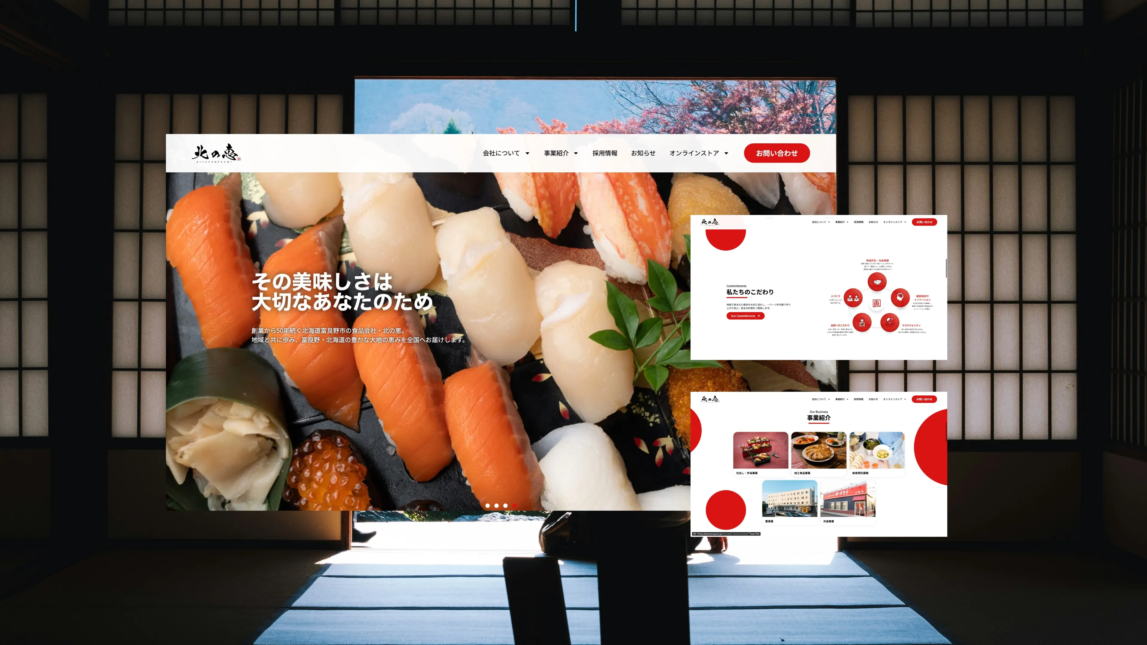
Kitano Megumi (北のめぐみ, "พรแดนเหนือ") คือแบรนด์อาหารพิเศษของญี่ปุ่นที่หยั่งรากในประเพณีการเกษตรของญี่ปุ่นตอนเหนือ นำเสนอผลิตผลและผลิตภัณฑ์อาหารระดับพรีเมียมจากภูมิภาค
สาม digital properties ทำหน้าที่ต่างกันในระบบนิเวศแบรนด์เดียวกัน: เว็บไซต์หลักสร้างเรื่องราวและความน่าเชื่อถือ ร้านค้าดูแลการขายสินค้า และระบบออร์เดอร์จัดการการสมัครสมาชิกและคำสั่งซื้อจำนวนมาก ทั้งสามต้องการการออกแบบ SEO และการกำกับภาพถ่ายระดับมืออาชีพ
กลยุทธ์แบรนด์และอัตลักษณ์ภาพ เลย์เอาต์ที่เรื่องราวนำหน้าด้วยสุนทรียศาสตร์ editorial แบบงานฝีมือ ธีม WordPress แบบกำหนดเอง SEO: คีย์เวิร์ดแบรนด์ + หมวดหมู่ การกำกับภาพถ่าย: ภาพ hero และภาพ lifestyle ของสินค้า
ออกแบบและสร้างร้าน WooCommerce หน้าสินค้าพร้อมบันทึกรสชาติ เรื่องราวแหล่งกำเนิด และการจับคู่อาหาร SEO: คีย์เวิร์ดสินค้าและของขวัญ การกำกับภาพถ่าย: flat lay สินค้าและภาพถ่ายบรรจุภัณฑ์
ออกแบบ UX ระบบออร์เดอร์ สถาปัตยกรรมขั้นตอนการสมัครสมาชิกและคำสั่งซื้อจำนวนมาก เชื่อมต่อกับระบบร้านค้าหลัก ปรับแต่งประสิทธิภาพ
การพิมพ์ ชุดสี คู่มือสไตล์ภาพถ่าย และคลัง UI component ที่ใช้ร่วมกัน — ทำให้แต่ละเว็บไซต์รู้สึกเหมือนโลกแบรนด์เดียว ไม่ใช่สามโปรเจกต์แยกกัน
สินค้าเกษตรระดับพรีเมียมของญี่ปุ่นแข่งกับตัวเลือกที่ถูกกว่าหลายเท่าบนหน้าจอเดียวกัน เมื่อผู้ซื้อมองไม่เห็นและชิมไม่ได้ ทุกอย่างจึงขึ้นอยู่กับว่าเว็บไซต์เล่าที่มาได้น่าเชื่อแค่ไหน
สิ่งที่ต้องออกแบบจึงไม่ใช่หน้าร้านออนไลน์ธรรมดา แต่คือ การส่งต่อความไว้วางใจจากผู้ผลิตถึงผู้ซื้อผ่านหน้าจอ
สามเว็บไซต์ เสียงแบรนด์เดียว ความซับซ้อนคือการรักษาความสอดคล้องทางภาพและประสบการณ์ข้ามสามแพลตฟอร์มที่มีหน้าที่ต่างกัน (แบรนด์ ขายปลีก ออร์เดอร์) ในขณะที่ต้องให้แต่ละแพลตฟอร์มทำหน้าที่เฉพาะของตนโดยไม่ทำให้ผู้ใช้สับสน ภาพถ่ายสินค้าอาหารยังเป็นตัวขับเคลื่อนการขายที่สำคัญในญี่ปุ่น — ภาพ stock หรือภาพถ่ายคุณภาพต่ำจะบั่นทอนการวางตำแหน่งระดับพรีเมียมของอาหารงานฝีมือจากภูมิภาคญี่ปุ่นทันที
ระบบออกแบบที่เป็นหนึ่งเดียวที่ใช้กับทั้งสามหน่วยงาน — การพิมพ์ ชุดสี คู่มือสไตล์ภาพถ่าย และคลัง UI component ที่ใช้ร่วมกัน ทำให้แต่ละเว็บไซต์รู้สึกเหมือนโลกแบรนด์เดียว ภาพถ่ายถูกกำกับด้วยสุนทรียศาสตร์ที่อบอุ่น เป็นธรรมชาติ และมีความเป็นงานฝีมือของญี่ปุ่นอย่างสม่ำเสมอ SEO สร้างทีละเว็บไซต์ โดยเว็บไซต์แบรนด์หลักมุ่งเป้าการรับรู้แบรนด์และหมวดหมู่ ร้านค้ามุ่งเป้าคำค้นสินค้าเฉพาะและของขวัญ และเว็บไซต์ออร์เดอร์มุ่งเป้าคีย์เวิร์ดการสมัครสมาชิกและสั่งซื้อจำนวนมาก
kitanomegumi.jp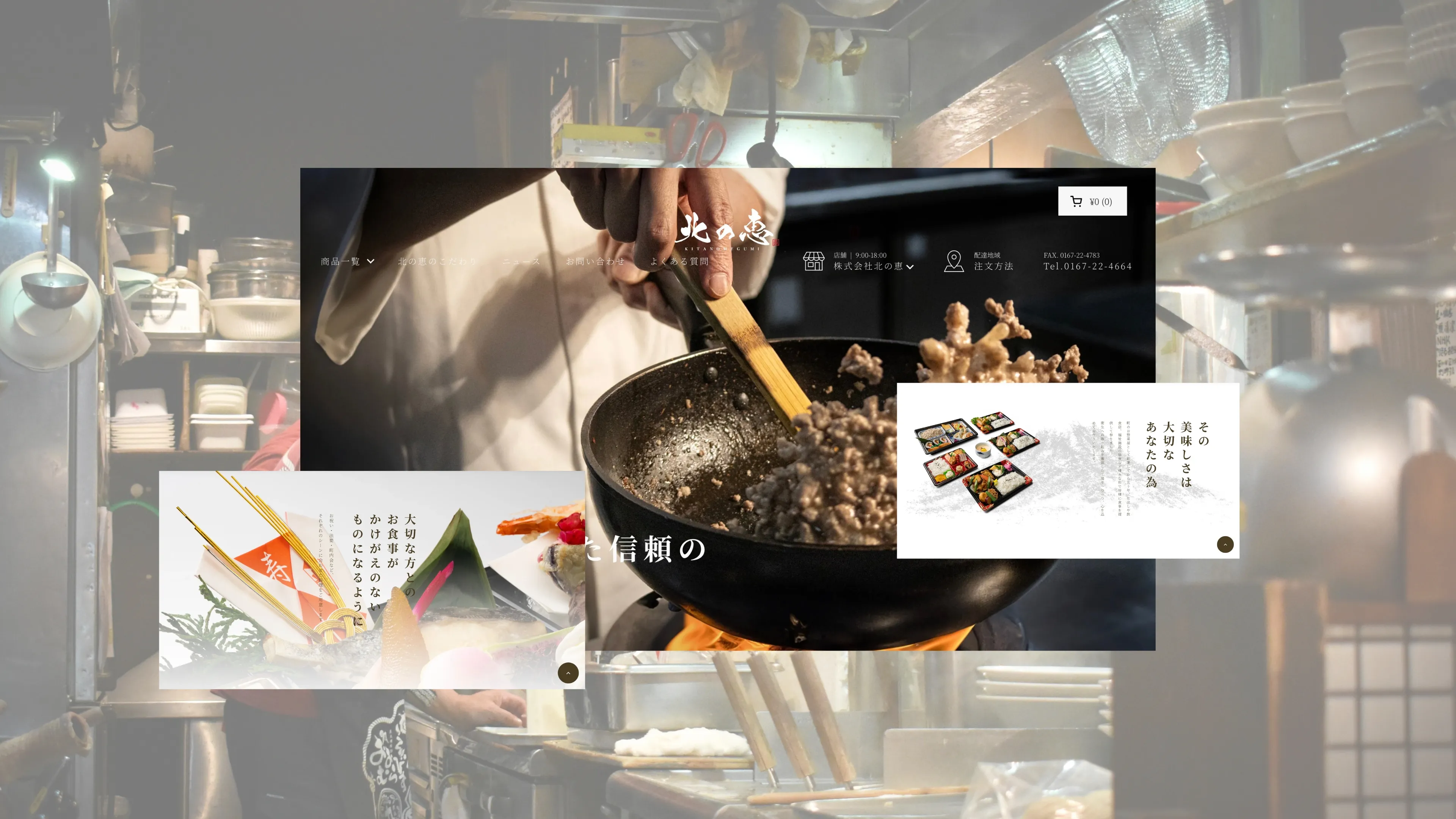 shop.kitanomegumi.jp
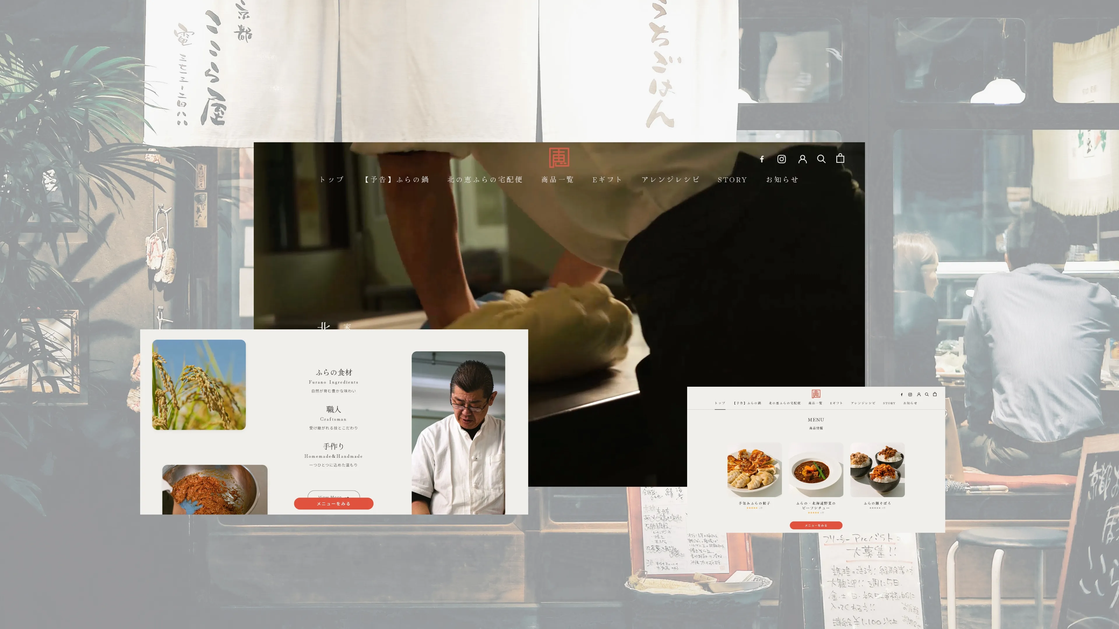 order.kitanomegumi.jp
 kitanomegumi.jp · Mobile
รายได้ต่อเดือนที่สร้างผ่านร้านค้าออนไลน์
เพิ่มขึ้นในมูลค่าออร์เดอร์เฉลี่ยเทียบกับระบบเดิม
ลดลงของออร์เดอร์เบนโตะทางโทรศัพท์เมื่อลูกค้าหันมาสั่งออนไลน์แทน
เล่าธุรกิจคุณให้ฟัง แล้วรับแผนพร้อมราคาภายใน 1–2 วัน แผนฟรี อ่านแล้วค่อยตัดสินใจ